Code
library(qs2)
library(Seurat)
library(dplyr)
library(ggplot2)
library(ggrepel)Volcano plots for the trisomy effect (Trisomic A vs Disomic B) in each plaque background (NLGF, hAPP), derived from the glmmTMB model fitted in scripts/glmmTMB.qmd. Points are coloured by direction and significance; top 20 up- and down-regulated genes are labelled.
Inputs: output/run1/objects/glmmTMB_with_interactions_corrected.qs2
library(qs2)
library(Seurat)
library(dplyr)
library(ggplot2)
library(ggrepel)run_num <- "run1"
objects_dir <- file.path("output", run_num, "objects")
required_input <- file.path(objects_dir, "glmmTMB_with_interactions_corrected.qs2")
if (!file.exists(required_input)) {
message("Required input not found: ", required_input,
"\nRun scripts/glmmTMB.qmd first.")
knitr::knit_exit()
}
final_df <- qs_read(required_input)
seurat_input <- file.path(objects_dir, "prelabelled_integrated_rpca.qs2")
if (!file.exists(seurat_input)) {
message("Required input not found: ", seurat_input,
"\nRun seurat_trisomy_v1/v2.qmd first.")
knitr::knit_exit()
}
seurat_obj <- qs_read(seurat_input)
# Run NormalizeData on the RNA assay to guarantee the "data" layer is the
# Seurat LogNormalize output (regardless of how the object was built upstream).
DefaultAssay(seurat_obj) <- "RNA"
seurat_obj <- NormalizeData(
seurat_obj,
assay = "RNA",
normalization.method = "LogNormalize",
scale.factor = 1e6,
verbose = FALSE
)
# Join split layers into a single "data" layer before extracting
seurat_obj <- JoinLayers(seurat_obj, assay = "RNA")
# logCPM: per-gene mean of the RNA "data" layer (LogNormalize output, scale
# factor 1e6 so values are interpretable as log counts-per-million) across all
# cells within each Background group. Used as the A-axis (average expression)
# in MA plots below.
data_mat <- GetAssayData(seurat_obj, assay = "RNA", layer = "data")
bg_vec <- as.character(seurat_obj$app_genotype)
logcpm_by_bg <- lapply(
unique(na.omit(bg_vec)),
function(bg) {
cells <- which(!is.na(bg_vec) & bg_vec == bg)
data.frame(
Gene = rownames(data_mat),
Background = bg,
logCPM = rowMeans(data_mat[, cells, drop = FALSE])
)
}
) %>% bind_rows()
final_df <- left_join(final_df, logcpm_by_bg, by = c("Gene", "Background"))volcano_cols <- c(
"Upregulated" = "#e41a1c",
"Downregulated" = "#377eb8",
"Not Significant" = "grey80"
)
generate_volcano <- function(df, bg_label) {
dat <- df %>%
filter(contrast == "A - B", Background == bg_label) %>%
mutate(
Status = case_when(
FDR < 0.05 & estimate > 0.5 ~ "Upregulated",
FDR < 0.05 & estimate < -0.5 ~ "Downregulated",
TRUE ~ "Not Significant"
)
) %>%
group_by(Status) %>%
mutate(GroupRank = rank(FDR)) %>%
ungroup() %>%
mutate(
Label = case_when(
Status != "Not Significant" & GroupRank <= 20 ~ Gene,
TRUE ~ NA_character_
)
)
n_up <- sum(dat$Status == "Upregulated")
n_down <- sum(dat$Status == "Downregulated")
ggplot(dat, aes(x = estimate, y = -log10(FDR), fill = Status, color = Status)) +
geom_point(aes(size = Status, alpha = Status), shape = 21, stroke = 0.2) +
scale_fill_manual(values = volcano_cols) +
scale_color_manual(values = c(
"Upregulated" = "black",
"Downregulated" = "black",
"Not Significant" = "grey90"
)) +
scale_size_manual(values = c(
"Upregulated" = 3,
"Downregulated" = 3,
"Not Significant" = 1.5
)) +
scale_alpha_manual(values = c(
"Upregulated" = 1,
"Downregulated" = 1,
"Not Significant" = 0.3
)) +
geom_hline(yintercept = -log10(0.05), linetype = "dashed",
color = "grey30", linewidth = 0.8) +
geom_vline(xintercept = c(-0.5, 0.5), linetype = "dashed",
color = "grey30", linewidth = 0.8) +
geom_label_repel(
aes(label = Label),
fill = "white", color = "black", fontface = "bold", size = 3.5,
box.padding = 0.5, point.padding = 0.5,
min.segment.length = 0, segment.color = "grey50", max.overlaps = 50
) +
labs(
title = paste0("Trisomy effect (A vs B) — ", bg_label, " background"),
subtitle = paste0(
"Top 20 genes labelled | FDR < 0.05 | |estimate| > 0.5",
" | Up: ", n_up, " Down: ", n_down
),
x = "Estimate (log FC, glmmTMB)",
y = bquote(bold("-Log"[10] ~ "FDR"))
) +
theme_minimal(base_size = 14) +
theme(
plot.title = element_text(face = "bold", size = 18, hjust = 0),
plot.subtitle = element_text(size = 12, color = "grey40", margin = margin(b = 10)),
axis.title = element_text(face = "bold", size = 14),
axis.text = element_text(face = "bold", color = "black"),
axis.line = element_line(color = "black", linewidth = 1),
axis.ticks = element_line(color = "black", linewidth = 1),
legend.position = "top",
legend.title = element_blank(),
legend.text = element_text(size = 12, face = "bold"),
panel.grid.minor = element_blank(),
panel.grid.major = element_line(color = "grey95")
)
}generate_volcano(final_df, "NLGF")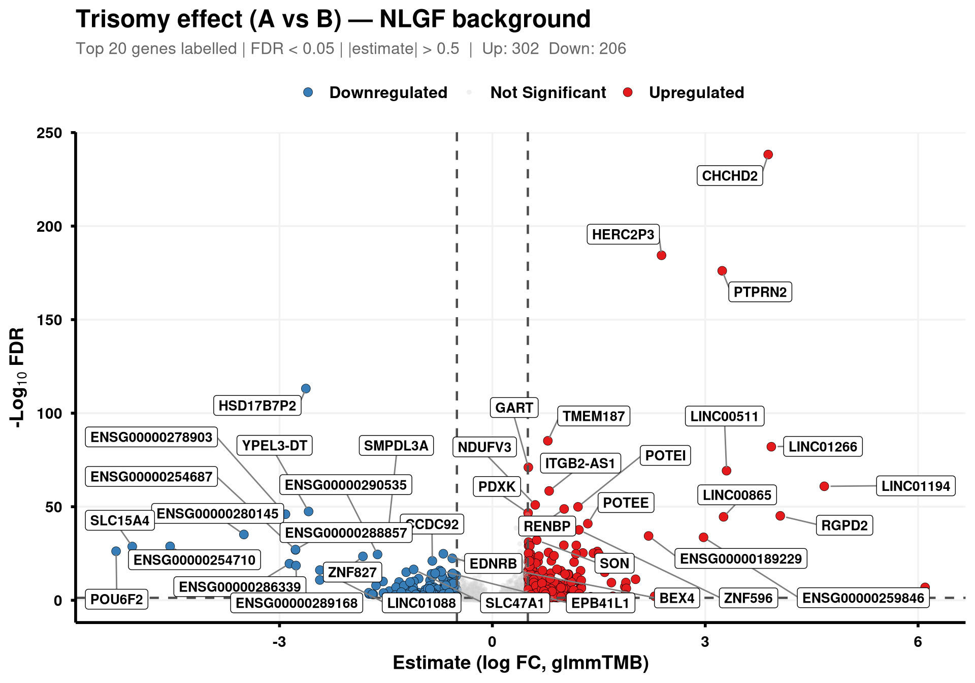
generate_volcano(final_df, "hAPP")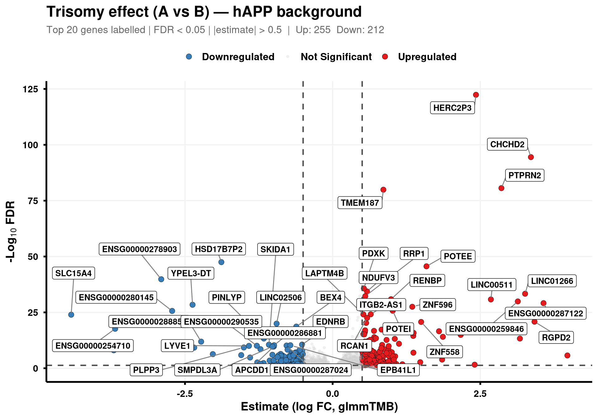
The x-axis (logCPM) is the per-gene mean of the RNA data layer after running NormalizeData(..., normalization.method = "LogNormalize", scale.factor = 1e6) on the Seurat object (so values read as log counts-per-million), averaged across all cells within each Background group (NLGF or hAPP). Top 20 significant genes per direction are labelled, ranked by logCPM (highest first). The x-axis is clipped just above the most abundant significant gene so the panel isn’t stretched by very abundant non-significant genes.
generate_ma_plot <- function(df, bg_label) {

  dat <- df %>%
    filter(contrast == "A - B", Background == bg_label) %>%
    mutate(
      Status = case_when(
        FDR < 0.05 & estimate >  0.5 ~ "Upregulated",
        FDR < 0.05 & estimate < -0.5 ~ "Downregulated",
        TRUE ~ "Not Significant"
      )
    ) %>%
    group_by(Status) %>%
    mutate(GroupRank = rank(-logCPM)) %>%
    ungroup() %>%
    mutate(
      Label = case_when(
        Status != "Not Significant" & GroupRank <= 20 ~ Gene,
        TRUE ~ NA_character_
      )
    )

  # Clip x-axis to the range of significant genes (with a small buffer) so that
  # very abundant non-significant genes don't stretch the panel.
  sig_x <- dat$logCPM[dat$Status != "Not Significant"]
  x_upper <- if (length(sig_x)) max(sig_x, na.rm = TRUE) + 0.2 else NA_real_

  ggplot(dat, aes(x = logCPM, y = estimate, fill = Status, color = Status)) +
    geom_point(aes(size = Status, alpha = Status), shape = 21, stroke = 0.2) +
    scale_fill_manual(values = c(
      "Upregulated"     = "#e41a1c",
      "Downregulated"   = "#377eb8",
      "Not Significant" = "grey80"
    )) +
    scale_color_manual(values = c(
      "Upregulated"     = "black",
      "Downregulated"   = "black",
      "Not Significant" = "grey90"
    )) +
    scale_size_manual(values = c(
      "Upregulated"     = 3,
      "Downregulated"   = 3,
      "Not Significant" = 1.5
    )) +
    scale_alpha_manual(values = c(
      "Upregulated"     = 1,
      "Downregulated"   = 1,
      "Not Significant" = 0.3
    )) +
    geom_hline(yintercept = 0, color = "black", linewidth = 0.5) +
    geom_hline(yintercept = c(-0.5, 0.5), linetype = "dashed", color = "grey30") +
    geom_label_repel(
      aes(label = Label),
      fill = "white", color = "black", fontface = "bold", size = 3.5,
      min.segment.length = 0, max.overlaps = 50
    ) +
    labs(
      title    = paste0("MA Plot: Trisomy effect (A vs B) — ", bg_label, " background"),
      subtitle = "Top 20 genes labelled per direction | FDR < 0.05 | |estimate| > 0.5\nx-axis: mean log-normalised RNA expression across cells in this Background",
      x = "Mean log-normalised expression (Seurat NormalizeData)",
      y = "Estimate (log FC, glmmTMB)"
    ) +
    coord_cartesian(xlim = c(NA, x_upper)) +
    theme_minimal(base_size = 14) +
    theme(
      plot.title       = element_text(face = "bold", size = 18, hjust = 0),
      plot.subtitle    = element_text(size = 12, color = "grey40", margin = margin(b = 10)),
      axis.title       = element_text(face = "bold", size = 14),
      axis.text        = element_text(face = "bold", color = "black"),
      axis.line        = element_line(color = "black", linewidth = 1),
      axis.ticks       = element_line(color = "black", linewidth = 1),
      legend.position  = "top",
      legend.title     = element_blank(),
      legend.text      = element_text(size = 12, face = "bold"),
      panel.grid.minor = element_blank(),
      panel.grid.major = element_line(color = "grey95")
    )
}generate_ma_plot(final_df, "NLGF")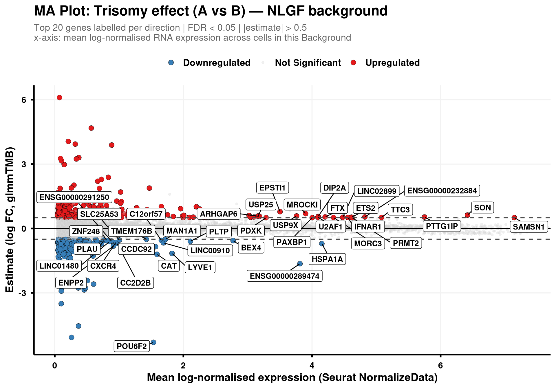
generate_ma_plot(final_df, "hAPP")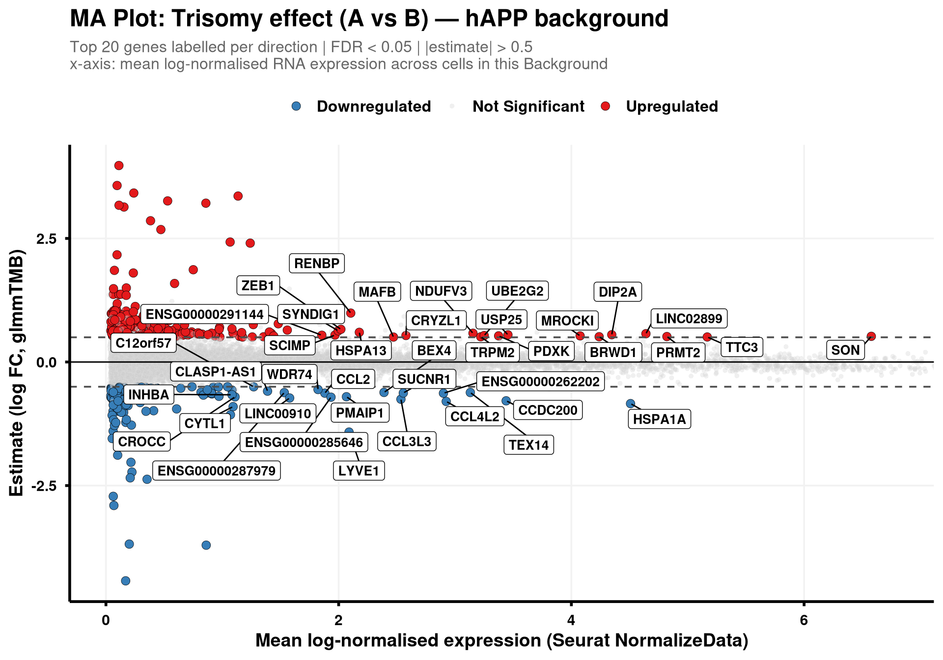
final_df %>%
  filter(contrast == "A - B", !is.na(Background), FDR < 0.05) %>%
  arrange(Background, FDR) %>%
  group_by(Background) %>%
  slice_head(n = 20) %>%
  select(Background, Gene, estimate, FDR, Interaction_FDR) %>%
  ungroup()